การวิเคราะห์ประสิทธิภาพ Machine Learning Model ด้วย Learning Curve

Learning Curve เป็นสิ่งที่แสดงถึงประสิทธิภาพการเรียนรู้ของ Model จาก Training Dataset ซึ่งแกน x ของกราฟจะเป็น Epoch และแกน y จะเป็นประสิทธิภาพของ Model โดยประสิทธิภาพของ Model จะถูกวัดหลังจากการปรับปรุง Weight และ Bias ด้วยข้อมูล 2 ชนิด ได้แก่
- Training Dataset
- Validation Dataset
ประสิทธิภาพของ Model จะวัดจาก Loss และ Accuracy โดยยิ่งค่า Loss หรือ Error ของ Model น้อย แสดงว่า Model มีการเรียนรู้ที่ดี แต่สำหรับค่า Accuracy ยิ่งค่า Accuracy มากแสดงว่า Model มีการเรียนรู้ที่ดี
Dataset ชุดที่แรก คือ Reuters Dataset
Import Library ที่ต้องใช้
from tensorflow.keras.datasets import reuters
from tensorflow.keras.models import Sequential
from tensorflow.keras.layers import Dense
from tensorflow.keras.optimizers import SGD
from tensorflow.keras.utils import to_categorical
from tensorflow.keras.preprocessing import sequence
import plotly
import plotly.graph_objs as go
import plotly.express as px
from matplotlib import pyplot
import numpy
from pandas import DataFrame
from sklearn.model_selection import train_test_split
import pandas as pd
Load Reuters Dataset
top_words = 5000
(X_train, y_train), (X_test, y_test) = reuters.load_data(num_words=top_words,test_split=0.2)
max_words = 500X_train.shape
Concat Train และ Test Dataset เพื่อคำนวณคำที่ไม่ซ้ำทั้งหมด
X = numpy.concatenate((X_train, X_test), axis=0)
y = numpy.concatenate((y_train, y_test), axis=0)

print("Number of words: ")
print(len(numpy.unique(numpy.hstack(X))))
ดูความยาวของคำในประโยค
print("Review length: ")
result = [len(x) for x in X]
print("Mean %.2f words (%f)" % (numpy.mean(result), numpy.std(result)))

pyplot.boxplot(result)
pyplot.show()
X_train = sequence.pad_sequences(X_train, maxlen=max_words)
X_test = sequence.pad_sequences(X_test, maxlen=max_words)

X_train.shape
นิยาม Model
model = Sequential()
model.add(Dense(8, input_dim=max_words, activation='relu'))
model.add(Dense(1, activation='sigmoid'))
model.compile(loss='binary_crossentropy', optimizer='adam', metrics=['accuracy'])
model.summary()
Train Model
his = model.fit(X_train, y_train, validation_data=(X_test, y_test), epochs=200, batch_size=128, verbose=2)Plot Loss
plotly.offline.init_notebook_mode(connected=True)

h1 = go.Scatter(y=his.history['loss'],
                    mode="lines", line=dict(
                    width=2,
                    color='blue'),
                    name="loss"
                   )
h2 = go.Scatter(y=his.history['val_loss'],
                    mode="lines", line=dict(
                    width=2,
                    color='red'),
                    name="val_loss"
                   )

data = [h1,h2]
layout1 = go.Layout(title='Loss',
                   xaxis=dict(title='epochs'),
                   yaxis=dict(title=''))
fig1 = go.Figure(data = data, layout=layout1)
plotly.offline.iplot(fig1, filename="Intent Classification")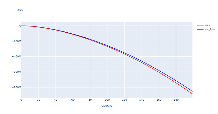
Plot Accuracy
h1 = go.Scatter(y=his.history['accuracy'],
                    mode="lines", line=dict(
                    width=2,
                    color='blue'),
                    name="acc"
                   )
h2 = go.Scatter(y=his.history['val_accuracy'],
                    mode="lines", line=dict(
                    width=2,
                    color='red'),
                    name="val_acc"
                   )

data = [h1,h2]
layout1 = go.Layout(title='Accuracy',
                   xaxis=dict(title='epochs'),
                   yaxis=dict(title=''))
fig1 = go.Figure(data = data, layout=layout1)
plotly.offline.iplot(fig1, filename="Intent Classification")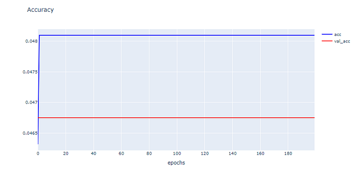
จากกราฟด้านบนพบว่าเมื่อมีการ Train Model มากขึ้น ค่า Loss จะมีแนวโน้มลดลง ส่วนค่า Accuracy ไม่มีแนวโน้มเพิ่มขึ้นเลย และยังมี Gap ระหว่าง Training Loss กับ Validation Loss รวมทั้ง Gap ระหว่าง Training Accuracy กับ Validation Accuracy สูง มากซึ่งแสดงว่าเรามี Training Dataset น้อยไป ไม่เพียงพอในการ Train Model เพราะฉะนั้นปัญหาที่เราพบในการทดลองครั้งแรกคือปัญหาที่เรียกว่า“Unrepresentative Train Dataset”
Dataset ชุดที่ 2
import library ที่จำเป็น
from tensorflow.keras.datasets import imdb
from tensorflow.keras.models import Sequential
from tensorflow.keras.layers import Dense
from tensorflow.keras.optimizers import SGD
from tensorflow.keras.utils import to_categorical
from tensorflow.keras.preprocessing import sequence
import plotly
import plotly.graph_objs as go
import plotly.express as px
from matplotlib import pyplot
import numpy
from sklearn.datasets import make_moons, make_circles, make_blobs
from pandas import DataFrame
from sklearn.model_selection import train_test_split
import pandas as pd
สร้าง Dataset แบบ 2 Class โดยใช้ Function make_circles ของ Sklearn
X, y = make_circles(n_samples=1000, noise=0.2, random_state=1)แบ่งข้อมูลสำหรับ Train และ Test โดยการสุ่มในสัดส่วน 50:50
X_train, X_test, y_train, y_test = train_test_split(X, y, test_size=0.5, shuffle= True)X_train.shape, X_test.shape, y_train.shape, y_test.shape
นำ Dataset ส่วนที่ Train มาแปลงเป็น DataFrame โดยเปลี่ยนชนิดข้อมูลใน Column “class” เป็น String เพื่อทำให้สามารถแสดงสีแบบไม่ต่อเนื่องได้ แล้วนำไป Plot
X_train_pd = pd.DataFrame(X_train, columns=['x', 'y'])
y_train_pd = pd.DataFrame(y_train, columns=['class'])
df = pd.concat([X_train_pd, y_train_pd], axis=1)fig = px.scatter(df, x="x", y="y", color="class")
fig.show()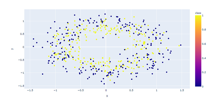
นิยาม Model
model = Sequential()
model.add(Dense(60, input_dim=2, activation='relu'))
model.add(Dense(30,  activation='relu'))
model.add(Dense(1, activation='sigmoid'))
model.compile(loss='binary_crossentropy', optimizer='adam', metrics=['accuracy'])
Train Model
his = model.fit(X_train, y_train, validation_data=(X_test, y_test), epochs=400, verbose=1)
Plot Loss
plotly.offline.init_notebook_mode(connected=True)
h1 = go.Scatter(y=his.history['loss'],
                    mode="lines", line=dict(
                    width=2,
                    color='blue'),
                    name="loss"
                   )
h2 = go.Scatter(y=his.history['val_loss'],
                    mode="lines", line=dict(
                    width=2,
                    color='red'),
                    name="val_loss"
                   )
data = [h1,h2]
layout1 = go.Layout(title='Loss',
                   xaxis=dict(title='epochs'),
                   yaxis=dict(title=''))
fig1 = go.Figure(data = data, layout=layout1)
plotly.offline.iplot(fig1, filename="Intent Classification")
Plot Accuracy
h1 = go.Scatter(y=his.history['accuracy'],
                    mode="lines", line=dict(
                    width=2,
                    color='blue'),
                    name="acc"
                   )
h2 = go.Scatter(y=his.history['val_accuracy'],
                    mode="lines", line=dict(
                    width=2,
                    color='red'),
                    name="val_acc"
                   )
data = [h1,h2]
layout1 = go.Layout(title='Accuracy',
                   xaxis=dict(title='epochs'),
                   yaxis=dict(title=''))
fig1 = go.Figure(data = data, layout=layout1)
plotly.offline.iplot(fig1, filename="Intent Classification")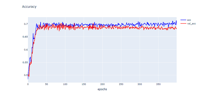
Dataset นี้มีลักษณะกราฟค่า Loss เป็นเส้นสีแดง(val_loss)และสีน้ำเงิน(loss)ตกลงมาช่วงหนึ่งแล้วพอผ่านไปสักพักเส้นสีแดง(val_loss) กลับมีค่าพุ่งสูงขึ้นแบบแกว่งเหนือเส้นสีน้ำเงิน(loss) ส่วนกราฟค่า Accuracy นั้น เส้นสีฟ้า(acc)มีการเรียนรู้ model ที่สูงกว่าเส้นสีแดง(val_acc) และมีแนวโน้มจะสูงขึ้นเรื่อยๆแบบแกว่งมากขึ้น ทำให้ Dataset ชุดนี้มีลักษณะของ Learning Curve เป็นแบบ Overfit Learning Curve ซึ่งนั้นหมายถึง model มีการเรียนรู้ที่ดีเกินไปจากการ train
